Scavango
An app concept combining BeReal-style spontaneity with a real-world scavenger hunt, taken from persona work through to a named, branded product.
What if BeReal's spontaneity met a scavenger hunt?
The starting idea was simple: take BeReal's core hook — an unscheduled prompt to capture a real, unfiltered moment — and layer in the structure and reward of a scavenger hunt. Users would get daily challenges that sent them out to explore their surroundings, capture a genuine moment, and compete or share with friends, all while keeping BeReal's raw, unposed feel.
Grounding the idea in who would actually use it
I built three personas to stress-test the concept from different angles: an adventurous urban professional looking for spontaneous things to do, a social media influencer who wants to be first on new platforms, and a teenager who's chronically online and looking for something to do with friends. Their goals didn't fully overlap, which was useful — it meant the design had to work for someone seeking a casual solo activity and someone treating it as a group, shareable event.
I also looked at three comparable products for design patterns worth borrowing: Wordle for its daily-challenge structure, Strava for live activity tracking, and Pokémon Go for how it layers AR-style interaction onto real public spaces.
From gray-box layout to a finished visual direction
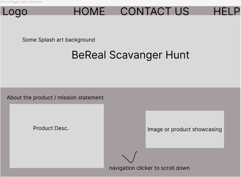
The site started as a plain gray-box wireframe — logo, nav, hero headline, an "About Us" block, and a product-showcase panel — just to lock the structure before touching visual design.
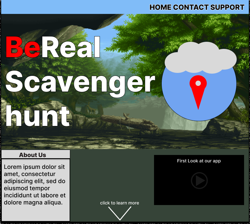
From there I moved into a comp that gave the concept an actual look: a forest photo backdrop, a red/white wordmark, and a compass-pin icon tying directly into the "explore your surroundings" idea.
Naming and identity: Scavango
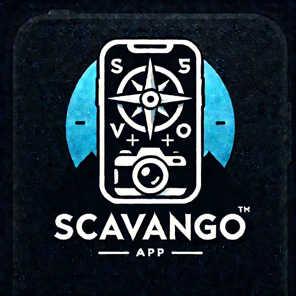
The concept later evolved into a standalone brand, Scavango — a platform for building and hosting real-world scavenger hunts, aimed primarily at educators, event planners, and organizers, with players as the secondary audience. That phase focused on identity: a compass-and-camera logo, a bio and tagline built around "explore your world, one clue at a time," and a go-to-market plan for launching on social media.
An honest note on scope
This project lived mostly at the concept and planning stage — personas, a competitive audit, a wireframe-to-comp pass on one key screen, and a brand identity — rather than a fully designed and tested product. It was valuable as an exercise in taking an idea from "what if" to something with a defined audience, a visual language, and a name, but it hasn't gone through the kind of user testing the other projects here have.