SpartCart
A team design response to campus traffic safety — from 36 wild ideas down to an underground cart system and a working app prototype.
How might we reduce traffic safety concerns on campus?
Our team of five was given a framing question, not a fixed brief: pedestrian and driver safety on a large campus with constant foot and vehicle traffic between classes. The goal was to reduce anxiety around crossing traffic, prevent accidents, and design something that could realistically influence how safely people move through campus.
36 ideas, ranging from practical to absurd on purpose
We ran a wide-open brainstorm before narrowing anything down — 36 ideas total, from genuinely buildable concepts like sensor-activated warning signs and physical barriers that block right turns during a crossing, to deliberately blue-sky ones like gondola lifts, ziplines, and an underground subway through MSU's old steam tunnels. Going wide first, including the absurd, was intentional — a note we got in feedback later was "don't get too hung up on realistic, it's not the best metric for assessing your ideas."
I explored my own concept individually: automatic retractable road spikes tied to the pedestrian crossing signal, rising when someone has the right-of-way and retracting once they'd cleared the crosswalk, giving drivers a hard-to-ignore physical cue rather than just a sign.
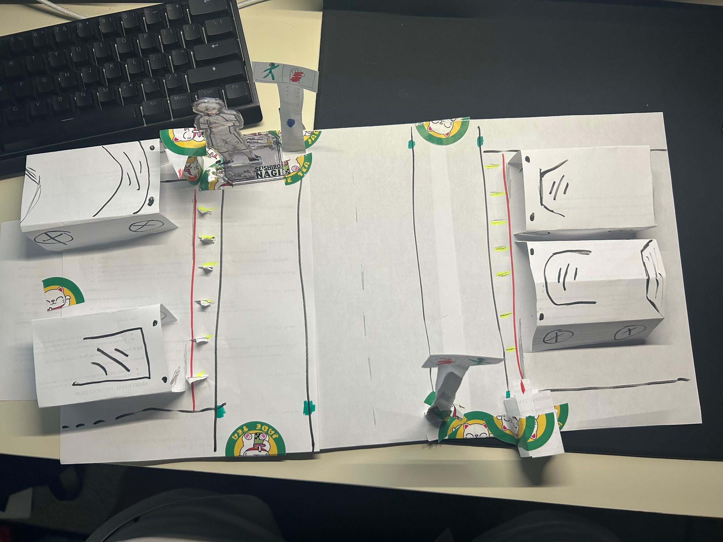
I built it as a paper experience prototype — a crosswalk scenario where paper spikes physically rise on cue and a sensor line shows when they'd retract. It was a small-scale stand-in for something that couldn't realistically be built full-size, but it made the interaction concrete enough for the team to react to.
From dozens of intersection fixes to one bigger idea
As a team, we converged on the "old MSU tunnels" idea and developed it into SpartCart — a minecart-style underground system meant to pull pedestrians off the roads and crosswalks entirely rather than trying to manage the conflict between cars and people at each intersection. Since building a life-sized prototype obviously wasn't realistic, we used Wizard of Oz methods and a series of lower-fidelity prototypes to simulate the experience instead.
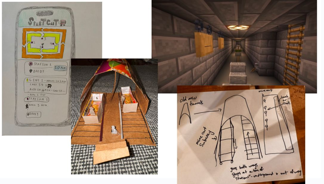
We worked through it in stages — hand sketches, a cardboard physical mockup of what boarding a cart might feel like, and a Minecraft-rendered tunnel to visualize the underground space at scale. I also ran an early Wizard-of-Oz walkthrough with a hand-drawn paper version of the app, manually "operating" the screens while a teammate interacted with it as if it were real, to test the reservation flow before we built anything digital.
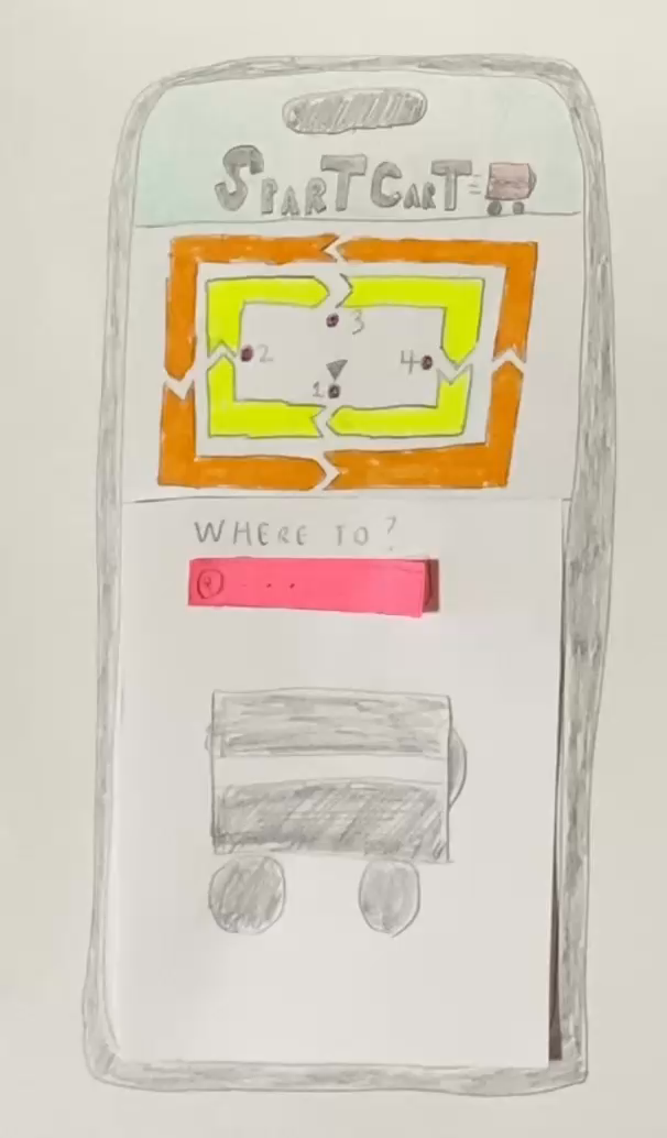
When a physical prototype ran out of usability information
The physical and Minecraft prototypes were great for establishing the space and the boarding experience, but they hit a wall — there wasn't enough there to actually usability-test how someone would reserve a cart or check timing. So we pivoted to a clickable app prototype in Figma, designed around four stations and two lines across campus, letting a user check station info, reserve a cart, and see live ETAs.
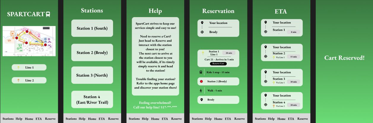
Real critique, and an honest list of what's unfinished
Usability feedback on the app was specific and a little humbling: the home button sat in a dead center that felt wrong, the main "reserve" action was tucked too far to one side, and buttons gave no feedback when pressed, which testers found frustrating. We didn't get to fix all of it — the team's own future-work notes call for simplifying the UI, cutting text in favor of visuals, adding clear press feedback, and polishing the logo and navigation.
The biggest takeaway as a team was about process, not the product itself: low-fidelity prototyping is genuinely good for ideation without getting bogged down by technical constraints, but "blue sky" thinking has to eventually meet a more realistic filter, and constant communication across five people mattered more than any single tool we used.